Overview
Situation:
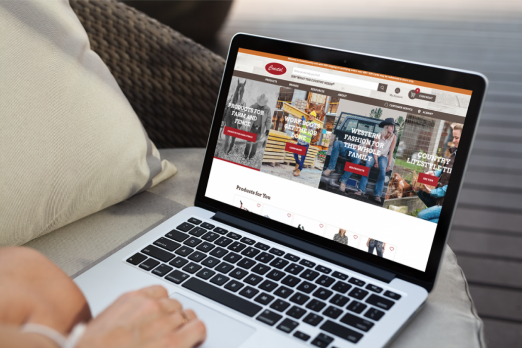
Coastal Country is a farm store supplier with multiple stores in the Northwest part of the United States. It had a WordPress website to support traditional ad-circular advertising. As the retail landscape changed, they recognized the need for digital transformation. I was brought in to lead the website digital discovery, strategy, and project setup for their eCommerce website. The design would include support for online purchases, in-store pickup and delivery using the Episerver platform, OrderDynamics order management system (OMS), and the InRiver product information manager (PIM). This project was a 6 figure website development project which was completed in 8 months.
Technologies: Episerver ECP, InRiver PIM, Order Dynamics OMS, Various payment systems.
Sites Deployed: Q4 2019
Tools: Axure, Photoshop, Zeplin, The solution strategy, UX and information architecture documents were managed in Confluence (this facilitated an efficient approval process between three parties involved in the development).
Personal Involvement:
On this project I led discovery and UX/IA strategy development efforts as well as directed a team consisting of a Business Analyst, UX designer and Visual Designer in their first UX development process. The team also included a PIM data architect and ERP Ecom lead.
Information Architecture and UX Workflow
To keep the project on-time and on-budget, we assumed the standard ecommerce page flow and focused most of our design efforts on the in-store pickup and delivery workflows.
Using stakeholder anecdotal info and secondary research, four major customer personas and 4 minor personas were developed. The product categories were mapped to various personas (see table below) to support personalized content and pictures for various product category pages.
A detailed competitive analysis was performed to identify the most successful competitors in-region and out-of-region. Since we had no budget for usability testing, we used best-in-class practices and design patterns to keep us familiar with the mindmap of farm-fleet customer types.
A total of 22 parameters were compared to identify successful practices
We mapped out the customer journey for each persona including in-store and digital touchpoints with various pick-up and delivery options.
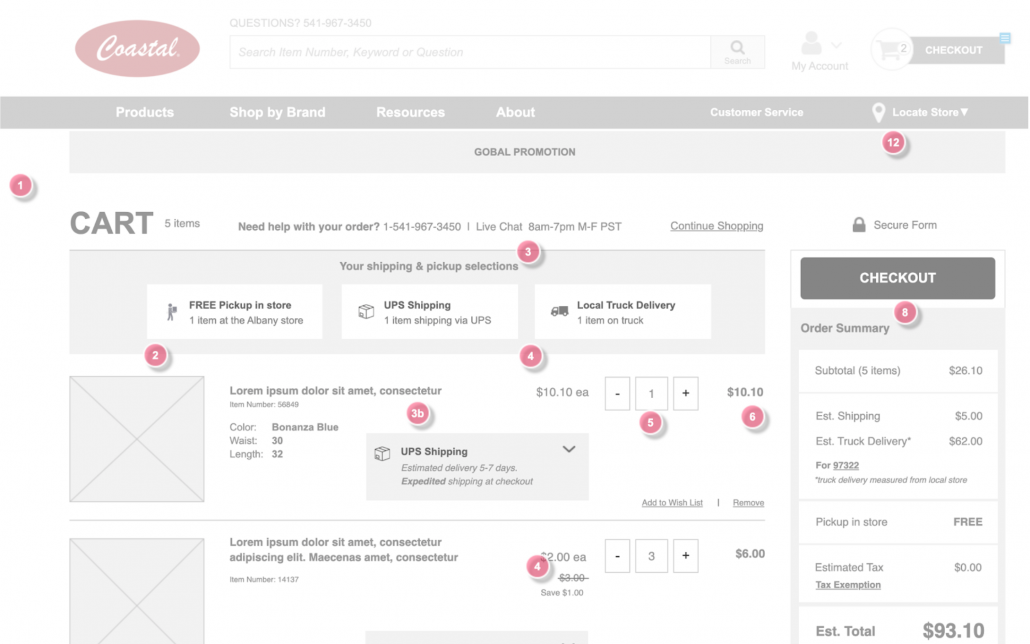
We used this, plus the product catalog structure, to build the sitemap. From there, the core of our effort was to build out detailed page specifications for 12 eCommerce template pages: Product List Page (PLP), Product Detail Page (PDP), shopping cart, Checkout, etc.
Complete page specifications were developed including a review of in-industry and out-of-industry studies for the eCommerce templates and the homepage of the website. Each page specification included page goals, features, widgets, and a comparison of best-in-class competitive/affinity web pages to ensure we had considered familiar and best practices including support for accessibility standards (e.g., ARIA).
Axure Prototypes
Then the UX designer and I prototyped all the template pages in Axure (desktop and mobile) for client review and some in-house testing. The blog and account management pages were prototyped in Axure as well.
Click on the image above to see a small sample of the desktop pages in Axure
Visual Design
From the prototypes, the visual design was executed in Photoshop and then output to Zeplin.io for the development team.
Handoff
The wires and visual designs (along with workflow and technical specs) were handed off to the development team for the start of sprints.
Conclusion
The project was completed on schedule and budget. There was no significant SEO equity to preserve and there was no budget for usability testing. By sticking to best-in-class practices, we accelerated the development and came in under budget.


